Rising like the phoenix; of app design
Adam Weekes
6 min read • 29 January 2019
As a product designer, we are often challenged to take an existing product and rework it into something that modernises and improves the user experience but something we’re really proud to put our name against.
We recently received that exact brief, from a very exciting client. So I’m going to take you through a real-life example of the product design journey at Dootrix…
Let's introduce our starting point...
The Client, SaferSeas Service aka SAS (FYI I’ll use this acronym from now on), an organisation fighting to make our Oceans and beaches cleaner. (Some of you may have seen them on BBC news recently). A massive tick on the type of clients we love to work with. ??
A little background…
The app itself was a way for people to find out if their favourite beaches were clean and usable for certain activities, such as surfing, kayaking and paddleboarding to name a few.
The Challenge
The SAS app, shall we say was made some years ago and as such the wheels had started to come off, both visually and technically speaking. So much so, that the app laid dormant, no longer to be found on the app store! ?
SAS has a loyal and passionate following that was eager to see this app rise up like up a phoenix! So with the challenge of satisfying a loyal and engaged community of people, it was onto the kick-off meeting and setting our strategy.
What was the best way to approach this?
We could redevelop the app? Make it work again and get it back up on the app store. It’s what the brief asked for, so what’s the problem, everyone’s happy right?

Nope, not even slightly.
It wouldn’t sit well with us, Harry & Ben at SAS or the users to roll out the old app. So, we put our heads together and thought this a chance at a new slate. If we’re relaunching the app, then let’s really re-launch it! ?
Learning from the past
We first, looked at the app in its current format (see the screenshots below). The app wanted to allow the user to subscribe to the beaches which they use the most. However, to first subscribe, they must tackle the rather challenging task of adding the beach. At this point, it is left to the user to know the exact coordination of the beach before being able to select it from the list.
Am I south-west, or south-east?
Even after to successfully adding the beach, the user is still none the wiser as to which activities can be performed at the beach without reading through paragraphs of copy. Not great for users that are the type who want to get up and go! Digital formats are a “lean forward and participate” medium. In contrast to say Television, which is a “lean back and let it wash over me” medium.
Users have time to read at most 28% of the words during an average visit; 20% is more likely. — From Jakob Nielsen’s seminal web usability study.
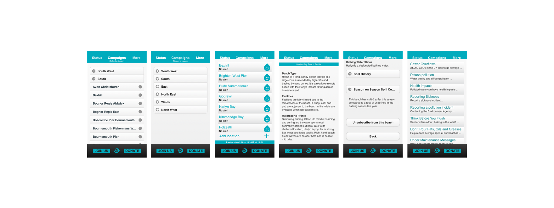

So with the knowledge and the determination to do better for the users, we set out on our journey.

First up, some planning...
And what comes with planning… scamps, doodles and workflows!!
No matter how good your designs are, the workflow always has to match. The workflow allows us to define the goals of the user and to set out a course on how they are going to progress through the app to ultimately achieve their goal.
So, we settled on our IA flows and using the JTBD framework decided on why and how users would use the app.
When I am going surfing, I want to quickly and conveniently check the conditions, so I can know whether I can go surfing at ‘X’ beach today.
We knew the above would be the core reason for the app, but we also thought about the new users coming on the app for the first time. What was the instant take away message we wanted to portray? For some users, they would be downloading this app to just check surf conditions, without knowledge of who SAS even are. This was a chance for us to quickly educate users on all the great work SAS do as a charity. A small onboarding process was needed to tackle this first hurdle. But it had to be simple, we didn’t want to lose users be making them read an essay before entering the app.
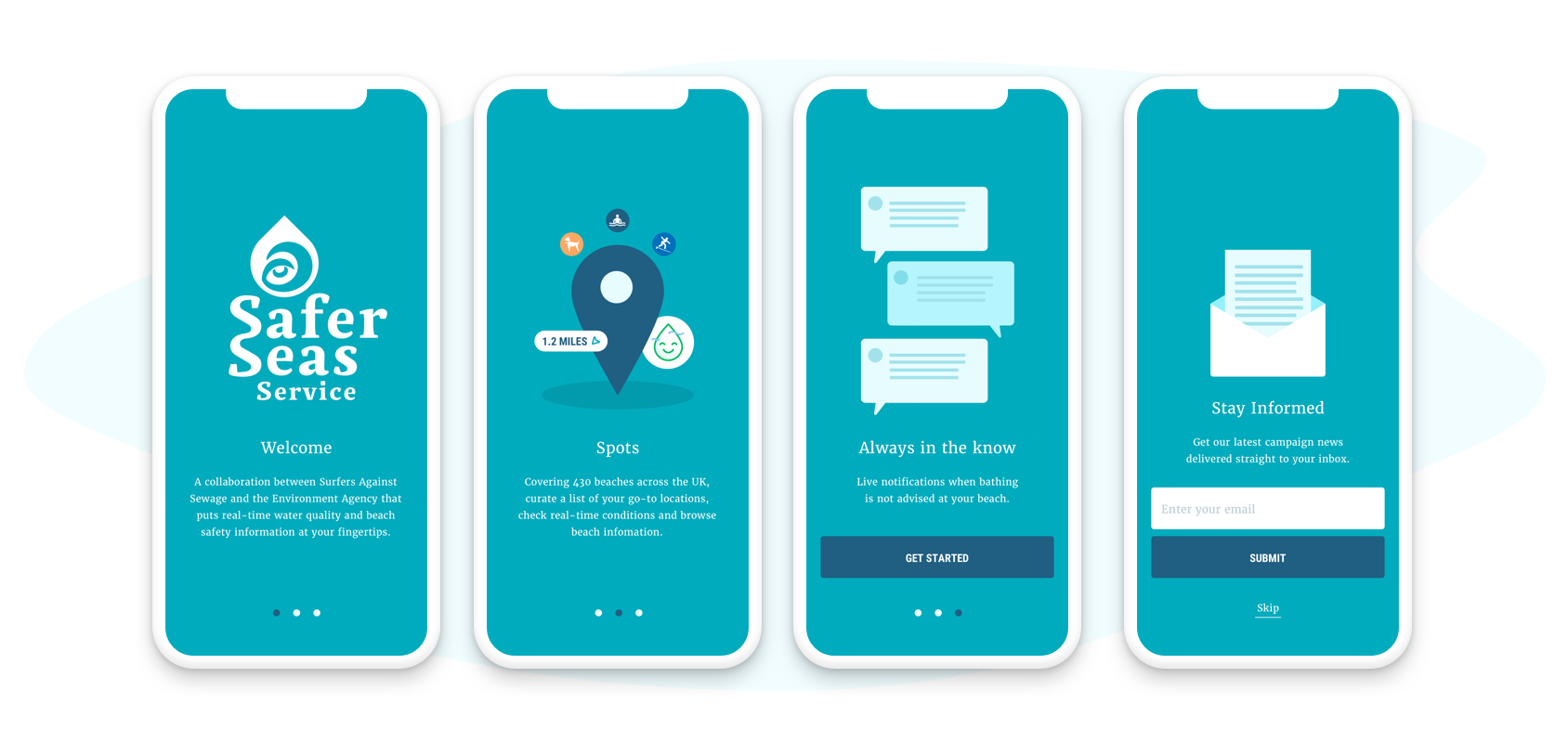
A picture tells a thousand words...
So came our next challenge, the user has gone through onboarding and they’re ready to add their first beach. Previously, the user would have been presented with a blank screen. This would have been their first real experience with the app. This doesn’t help the user, at this point, there is no guidance or obvious start point. They are more likely to abandon the journey than anything else ?
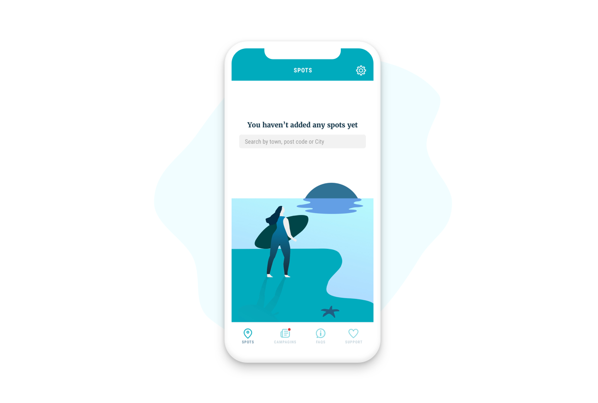
We changed that by bringing in an illustration to the blank state, which not only allows the user to understand the next steps but also allows SAS personality to instantly come across.
The simpler the better
The next challenge was making the task of subscribing to a beach as simple as possible for the user. We wanted to design the process so that it can aid the user wherever possible. For example, we know where the user is based on the device’s location settings, so let’s use that to our advantage!
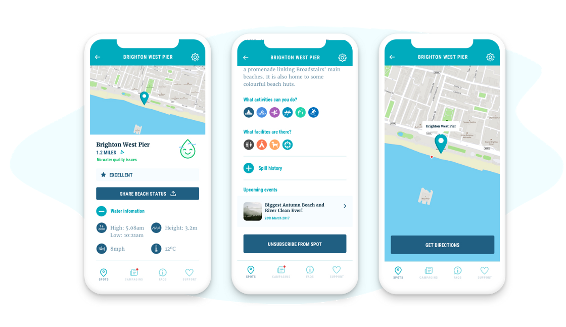
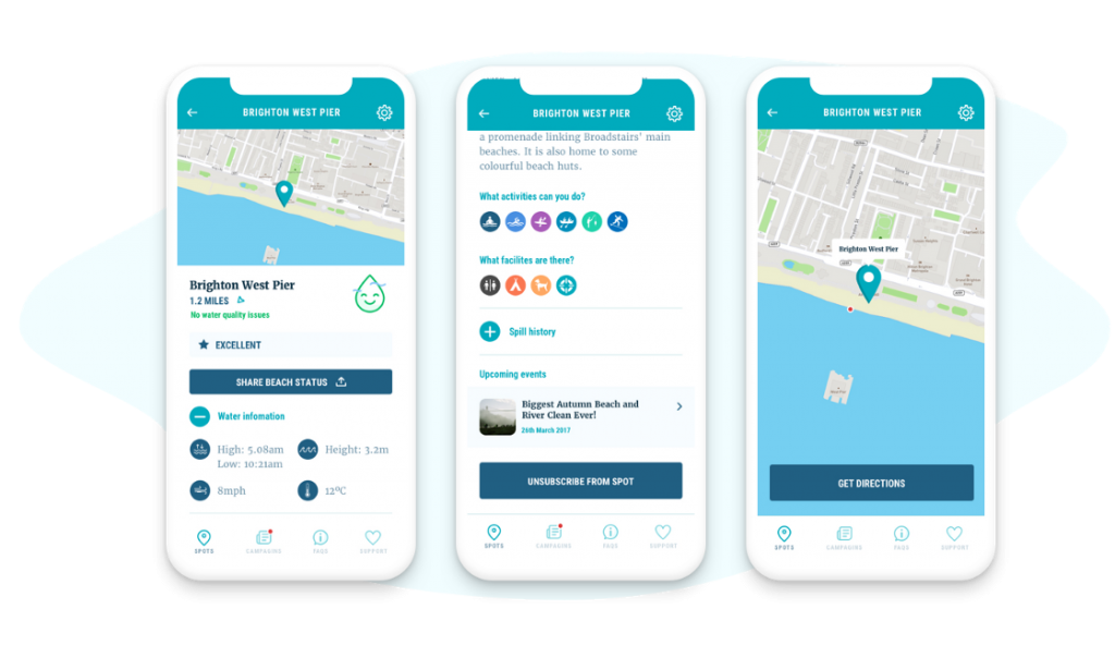
With our user research, we know that the user will either be wanting to check on the beaches nearest to them or for an upcoming visit. So we designed it so that straight away the user can see the beaches ‘Nearby’ to them and able to select them without having to tap the search input. Simple!
Our next step was to bring the right level of information to the surface to help the user make an informed decision. We have information about the distance from their location, the types of activities, facilities, tide times, everything. But we looked at what the user needs first, what makes them choose a beach?
They choose a location because they want to do an ‘activity’
With that knowledge, we developed a series of icons for each activity. Each activity is given its own distinct icon and colour. As users see shape and colour before anything else. This way users can start to quickly use this system to pick out the key activities that are personal for them.
After adding desired beaches to their list, we wanted to carry on that simplicity of only surfacing the relevant information to the user at this stage.
Happy waterdrops = Happy people ?
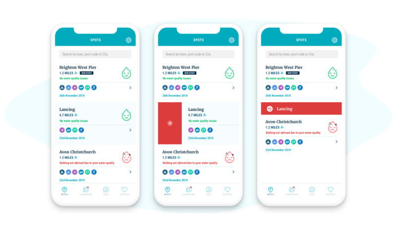
They’ve gone through the list when adding the beach, so let’s keep that view here. There is no need for the user to be presented the same information in a totally new format.
Habit forming and consistency is the key with app design
So, much like before, we brought more of the relevant information to the surface. Let the app do the leg work for the user.
What else does the user need to know at this stage?
Here is where the core aim of the app starts, to alert on the condition of the water at a beach location. We needed this to be the most obvious and clear piece of information on the page. To do this we used two very clear colour coded icons. A green and happy water drop, Go ahead, surf away! A red and sad water drop, Sorry not today, Stay away! Both clear and concise.
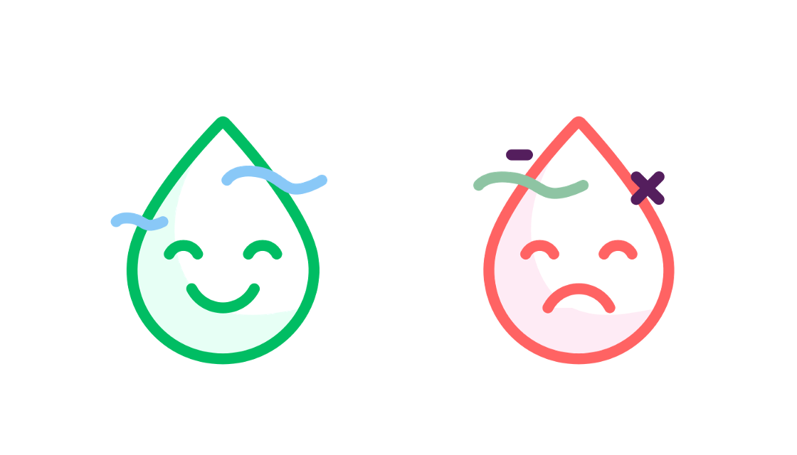
The secondary goals are to reassure the user that this information is the most up-to-date, so we included a time stamp and a notification bar to show all new events.
Our next thought was on how users should interact with this list. How can we make it as simple as possible to add or remove a beach location?
For adding a beach, we included a constant search bar at the top of the list, the moment a user taps into this list it opens up the same ‘add a beach’ journey that the user first went through. Remember Habit forming and consistency wins the day.
Removing a beach, we used a swipe commonly used in interaction design. But we went a stage further and designed it to allow for affordance for the user who accidentally swipes on a beach. Whilst they remain on the screen they are presented with an undo option.
More information, more power! ?
One of the big changes we made to the app is the information available on the beach profile pages. Previously we had a large amount copy describing the beach. We wanted to break this up and create a visual hierarchy, to ultimately make the copy more digestible, all whilst adding valuable insights. To do this we integrated a new API that would give us information such as Tide height, Water temperature and wind speed to name a few. All kept simple by clear and consistent iconography.
Next, we took advantage of an iOS native behaviour, making a simple integration into Apple/Google maps. Within a few clicks, it allows the user to get instant directions to their desired beach. This is was our aim throughout, everything needs to be achieved within a few taps.
In conclusion
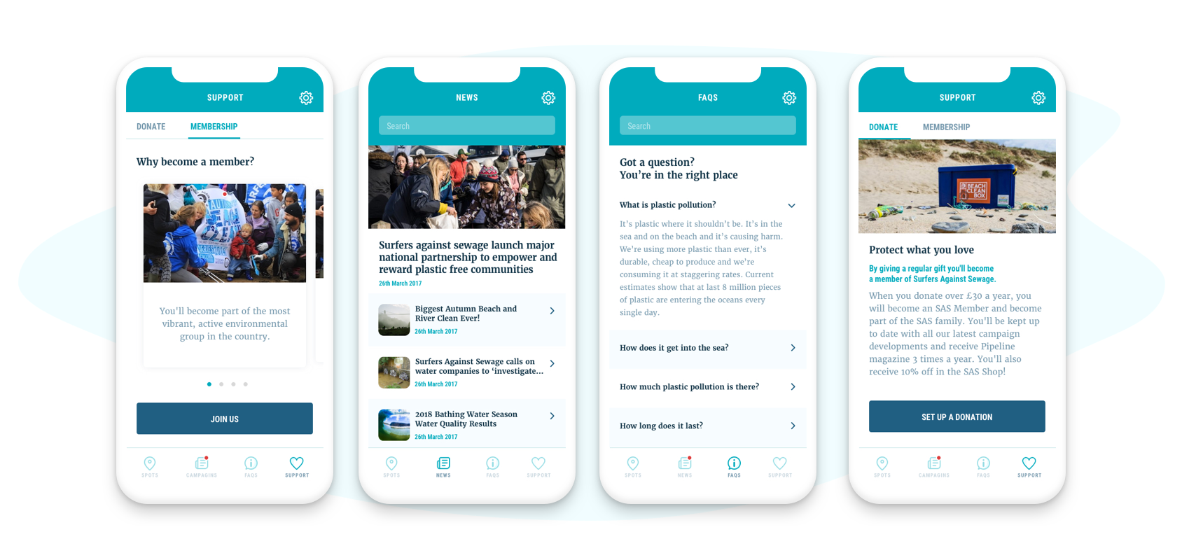
When modernising or innovating an app, we sometimes need to take a step back from what the brief tells us. In this case, we could have easily reproduced the same app with the same visuals and functionality. But who would that have benefited?
But Dootrix and SAS ultimately believe in doing what’s right for the user. By using frameworks like JTBD, scamps and even quick prototypes, we validated our ideas and showed that with slightly more design work up front, the value we can add for the user and ultimately the product could be huge. Allowing the Phoenix to rise and delight the loyal coastline community.
Push to get what is right for the user.
If you’d like the sound of that, our door is always open, drop us a line at hello@dootrix.com
So until next time and be sure to check out the app coming this April!
Adam Weekes

