

For the uninitiated, skeuomorphism is
“A graphical user interface design to describe interface objects that mimic their real-world counterparts in how they appear and/or how the user can interact with them”
For those looking for a pop quiz answer
“digital buttons that look like real buttons”
If there’s one topic I see brought up more than I would like, its skeuomorphism and its place in the world of design.
Firstly, let’s make one thing clear, I’m not against skeuomorphism in of itself. It served its purpose when it was needed and it led to the greatest undertaking of technological societal change in history. It played its part wonderfully. By its definition, it was used as a guiding hand through the new and unfamiliar digital terrain that has since changed the world.
So what exactly am I against with my vaguely insulting title? My issue, in fact, lies with those among us that believe skeuomorphism should see a return to its former glory, that design has become too formulaic, too cookie-cutter and that the only real way back to a sense of uniqueness and individuality is skeuomorphism (or at least its an option).
This has always felt like change for the sake of change as opposed to moving forward with purpose. I’ve long been a believer that a vast majority of UI and product designers at the moment are graphic designers in disguise, looking for the next trendy aesthetic to work into the newest problem, I should know, I started as that type of designer.
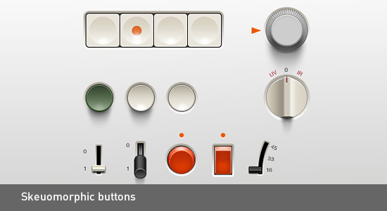
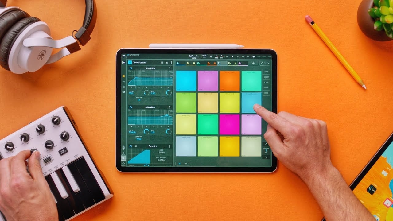
But real, solution-based design IS cookie cutter, we should take pride in solving a problem, we shouldn’t need to dress it up in forty different ways to feel validated. Take the image above for example (Scroll up). Let’s say it’s a recording device of sorts. I, like you and countless other designers will look at that and say YES! that is gorgeous, the subtle off-white buttons with some good ol’ common region UX law, the almost tactile look of the nobs where you can mentally hear the “clunk” when you turn it, the purposeful use of colour! Brilliant.
Nevertheless, the basic function of a recorder here has been made cumbersome and difficult to use when modern product design is taken into account. Look at the interactions available to the user and ask how many can be automated away? Almost all of them by 2019 standards, a casual user expects to be able to push one button and be done.
Skeuomorphism meets UX Laws, Dieter Rams and common sense
If you need a refresher or you just need to know…click here…for the brilliantly curated list of UX Laws by Jon Yablonski
Something often ignored when people advocate for the return of skeuomorphism is how it contradicts its very definition. Simply put, users don’t need skeuomorphism to understand digital spaces anymore because they understand those spaces just as easily now as they would a real-world interaction.
In fact, it's reasonable to make the argument that at this point it would actually confuse a user more if they were to experience their digital spaces with skeuomorphic design. The reason for this is to emulate the real world you emulate its spaces, when you emulate its spaces you are inherently emulating its solutions. Suddenly a library app has shelves to hold virtual items, an app for reading has pages so the publisher doesn't run out of space, so on and so forth.
With this in mind, the ability to have a continuous digital vision is hindered because the accommodation for nonsensical solutions has been met.
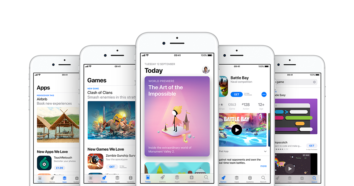
If you have an Apple device, browse around their native apps, primarily the app store, Apple Books and Apple News. With the shackles of skeuomorphism removed, each app can define a coherent digital space that a user can be familiar with, without having ever picked up a newspaper, gone into a library or browsed a store.
We see these shackles of skeuomorphism in brand identity as well, below is one of Instagrams earliest logos with its sub-brands following.
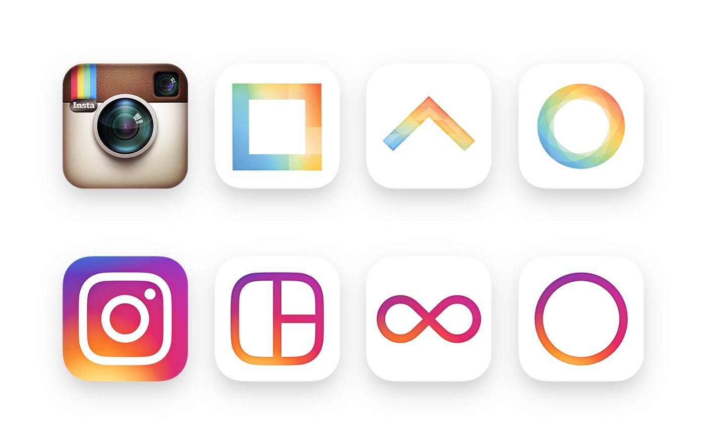
Unless you were a hardcore user you wouldn’t know that the three sub-brands were anything to do with Instagram, there aren’t really any real-world counterparts to a boomerang that you can apply to an app icon and have a new user instantly know “ah that works with Instagram, my photo application”. The modern logo, while heavily mocked at the start, actually solves this solution.
(Edit after watching Abstract: The Art of Design Season 2, Ian Spalter supports this)
So let’s talk about UX Laws
There are two laws I want to focus on primarily but plenty more could just as easily be here. Those laws are Hick’s Law and the Law of Prägnanz. Hick’s Law states that the time it takes to make a decision increases with the number of complexities that confront the user. This seems straightforward to anyone today but this was only fully studied in the 1950’s. Slightly more complicated is the Law of Prägnanz which states that people will perceive and interpret ambiguous or complex images as the simplest form possible because it is the interpretation that requires the least cognitive effort of us.
If we join these together we can immediately see how they would immediately rule skeuomorphic design out as a solution compared to current day approaches.
It's in-fact the second part of Prägnanz’ law that is the real nail in the coffin for skeuomorphism as a modern user-centric solution. “it is the interpretation that requires the least cognitive effort of us.”
We see this in iconography, we’ve seen it throughout generations of typography and perhaps familiar to most, we see it in logo design. Instagram doesn’t need a highly rendered camera to tell us its a camera app. Let's face it, why bother at all if our brains are going to discount huge portions of the information anyway, just to help itself remember what an icon can already tell us at a fraction of the time with less pressure on the user.
Real-world design meets digital design
“I hate everything that is driven by fashion. From the beginning it was hating the sixties American way of styling. Especially the cars. They changed their cars every two years to sell new ones. Which has nothing to do with good design” — Dieter Rams
10 Principles of Good Design
Dieter Rams is one of the most respected designers in the world, he is renowned for his purist view on what design means to the world and in recent years has become known for being the core inspiration to the former Head of Design at Apple, Jony Ive.
This is perhaps a post for another time but there is a distinct lack of Dieter Rams’ ten principles in digital product design. Now let's not get it twisted, Rams’ principles don’t translate word for word and some even come undone in the world of digital product design, regardless there are great points of knowledge that could be carried over that simply aren’t.
Principle number six for example, “Good design is honest”, how many times can we think in the last few years that this principle has come undone throughout cloud storage, social media and simple apps designed to gather our data.
That said, plenty of other principles come clearly into focus when viewed alongside digital product design. “Good design is unobtrusive”, “Good design makes a product useful” and probably most important of all “Good design makes a product understandable” are all in a position to play a role.
If we are to push forward for a more defined, even cookie-cutter way of solving design problems, we need a baseline, skeuomorphism simply doesn’t fit into that future of functional, people-focused design.
“BUT! I REALLY REALLY LIKE SKEUOMORPHISM!”
Okay okay, within reason I supposed skeuomorphism is acceptable. I would be remised if I didn’t take into account one of Rams’ principles that do defend that use of skeuomorphic design.
Principle 3: Good design is aesthetic
When it comes to an aesthetic it makes sense for some applications to maintain the real-world visual. Sound engineering is one of those spaces that the user will almost always be using physical products alongside digital products, for this workflow, it makes complete sense to keep the two visuals identities aligned.


