
Let’s be honest. As designers, it’s easy to conform to our own biases when creating a new product or feature. We sometimes fall into the trap of basing our judgement on our assumptions, without taking into consideration the wide range of diversity around us. By doing this, our designs unintentionally target a specific set of people, whilst excluding others from using our product as intended.

Inclusive design should be at the top of your list of priorities if you’re looking to create a strong, innovative product with a far reach. It should not be seen as a v-next feature or an afterthought. Your product should never exclude anyone.
So with that in mind, how do we ensure that we are designing for inclusivity when we create products and explore new ideas? Below I’ll share with you a few key actions that we take as part of our design workflow here at Dootrix.
Research
Right from the start, we carry out extensive research before we undergo any design work and make sure that we continue this habit throughout the product’s lifecycle. There’s always something new to find out about a product, and we believe that learning is an iterative process.
This includes comparing existing products on the market to see what is already being done well, or what could be improved upon. One of the benefits of doing this is to avoid “reinventing the wheel”. If something is already being done really well somewhere else, we should look to utilise that functionality in our own designs. (If you do want to reinvent the wheel, however, make sure that what you’re designing is an improvement, and doesn’t hinder the user’s experience).

User testing
Each time we design a new product or feature, we schedule and run user tests against the prototype with a variety of users before we push it into development. We do this to validate that what we have designed is easy to understand, can be navigated without any trouble and ultimately aids all users in completing the goal they sought out.
For user testing, we write a simple user testing script that outlines the areas we want to sanity check. The script contains a list of tasks to be completed by each user that would allow us to observe their reactions and responses to our designs. We make sure that the user is aware that we’re looking for honest feedback so that we can get as accurate a response as possible.
Once the test is over, we take all of our feedback and reiterate over our designs, to make sure that we’ve made any necessary changes to further direct our product in the right direction.
Tips & tricks/resources
The best source of truth for accessibility is the Web Content Accessibility Guidelines by W3. This document outlines in detail the 5 recommended areas to focus on to improve your product’s accessibility. While it can feel daunting initially, the page is laid out extremely well and each section is dedicated to just one
There are also great resources online, like this contrast checker which act as a fast way to check that your colour palettes adhere to the correct contrast ratios or WebAIM’s checklist.
Accessibility tools like these don’t just live on the web. If you use Adobe XD, Sketch or Figma, plugins like Stark are also available to you. Stark allows you to check the contrast of your designs live inside the prototype tool, meaning you can quickly adjust colours, visuals and typography until your prototype passes the desired accessibility standards. It also has a great colourblindness simulator and colour suggestions for fast colour palette selection.
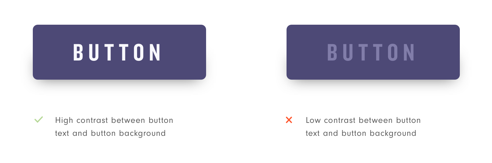
Below are some examples of what to look out for and be mindful of when it comes to checking that your prototype meets the accessibility criteria (in our case, we want to be at least AA standard, which is the standard that all web sites and apps in the public sector must meet).
As an example of how important contrast is, take these two buttons. One has a label that has a high contrast between it and the background, and one where the contrast does not meet AA standard. The version on the left is much easier to read than the one on the right.
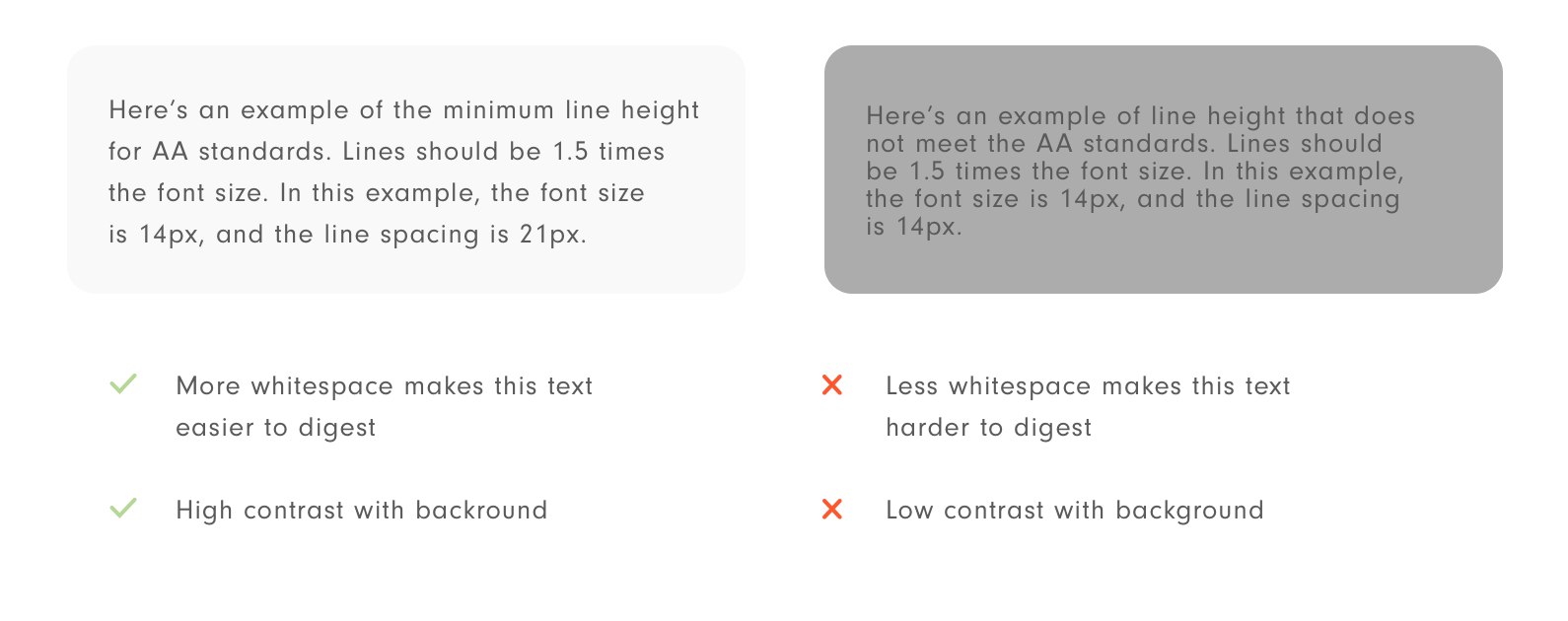
When adding text to a page, we want the user to be able to read it with ease. This means designing text to be as legible as possible. To do this, the general rule of thumb is to ensure there’s a high contrast between the foreground and background, and the line spacing is at least 1.5 times the size of the text.
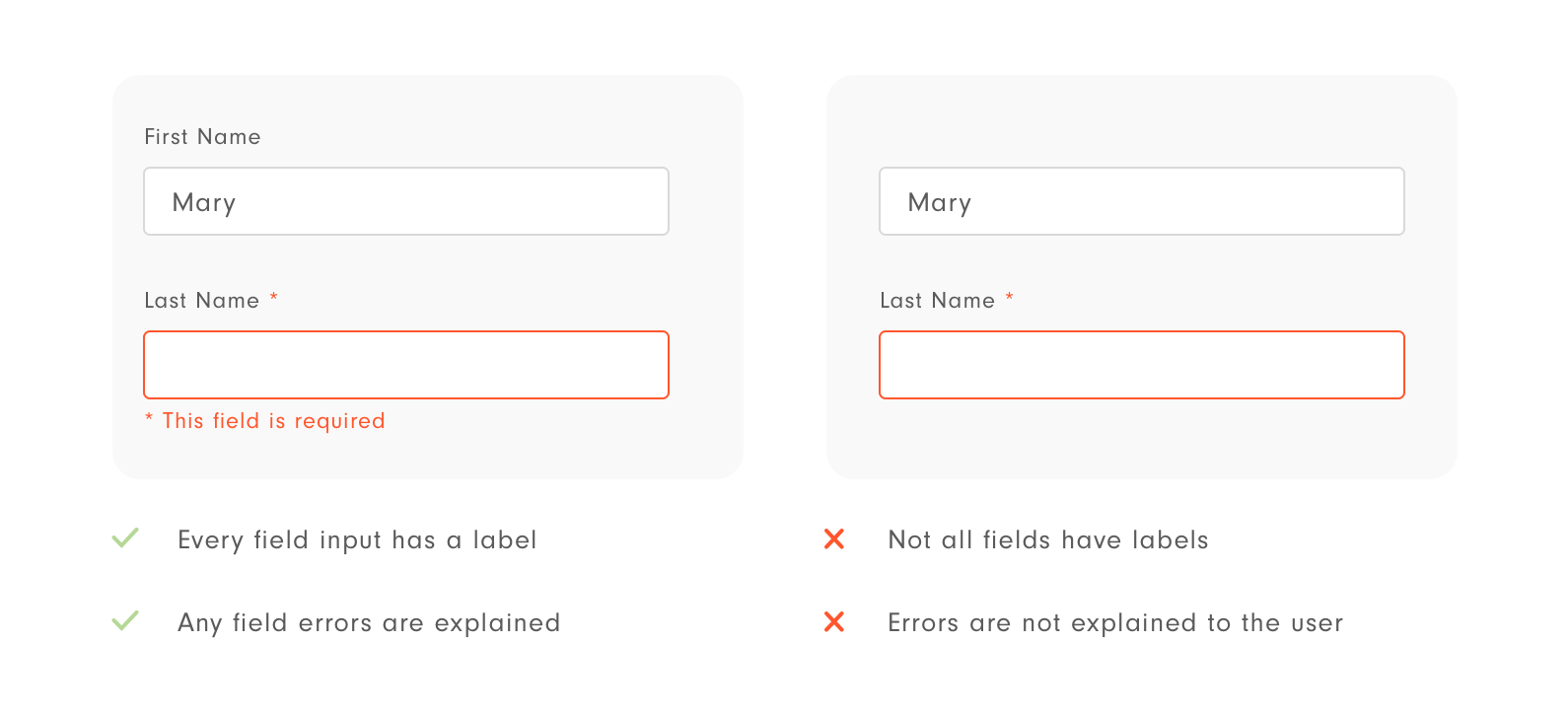
It’s important when building forms to be transparent with the user. Every field should have its own label at all times to avoid confusions. It’s also important to explain any errors that arise to the user, as without explanation the user may not understand the issue.
Conclusion
It really is a no brainer for your business and customers alike to ensure that every product is inclusive for all. In this day and age, it’s easy to run quick and simple checks against designs that are truly impactful in the long run.
If you’re keen to learn more about how we at Dootrix could help you unlock the power of design thinking to supercharge your product design, you can find more information about our own innovation sprint workshops here.


